Saturday, 29 October 2016

Blue Fern Studios Design Team Call

Saturday, October 29, 2016 0 Comments
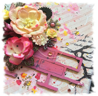
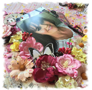
Hi everyone! Today I'm sharing a layout I created using papers and chipboard from Blue Fern Studios. I have submitted this layout as part of my application to join Blue Fern Studios Design Team in 2017. These papers are just gorgeous and the chipboard and stamps all coordinate beautifully. The paper I have used is from the Montage Collection called "Invitation" and the chipboard is Shabby Brick Bits.


Thanks for stopping by!

Those Eyes - 2 Crafty Design Team Call

Saturday, October 29, 2016 0 Comments
Hi everyone! Today I'm sharing a layout created using various chipboard embellishments from 2 Crafty Chipboard. I created this layout featuring my gorgous boy Harley as part of my application to join their Design Team in 2017. The chipboard I have used are: Checkerboard Clumps, Olivia Frame and the title "Those Eyes". I was wondering what to title the layout when I found the title piece hiding in amongst some other craft items. It just finished off the layout perfectly! I mean, look at those eyes!


Products Used:
Kaisercraft Base Coat paper - Weathered
Dylusions Spray - Black Marble
Tim Holtz Distress Ink - Hickory Smoke
Ranger Enamel Accents - Lily Pad
Ranger Embossing Powder - Copper
Kaisercraft Wooden Flourishes - Cogs
Tim Holtz Studio - Sprocket Gears
Kaisercraft Texture Stamp - Crackle
Various flowers, blooms and buttons from stash

Thanks for stopping by!

Wednesday, 19 October 2016

More Than Words - October Challenge

Wednesday, October 19, 2016 18 Comments
Hi everyone! Here is my entry into the More Than Words challenge for October. More than Words challenges are based on a word inspiration and creative challenge as well as mini challenges in the last week of the month. For October the challenge is:
 
Word Inspiration - Change
Creative Challenge - Ombre

How was I inspired by the word Change? I wanted to use the selfie photo with the butterfly filter from Snapchat on a layout for a while. This was the perfect opportunity! I've taken the blue from the filter as my Ombre colour and the butterflies promted me to use the quote about change - If nothing changes there'd be no butterflies!


Thanks for stopping by!

Saturday, 15 October 2016

White... with 1 Challenge October - Cayenne

Saturday, October 15, 2016 16 Comments
Hi everyone! This is my layout that I created for the White... with 1 Challenge. This month's colour is Cayenne. I had a photo of my sister's cat Mittens on my phone and the blanket he is on was the perfect colour for this challenge.


Products Used
Tim Holtz Grit Paste
Finnabair Stencil -  Dots & Stripes
Dylusions Ink Sprays -  Postbox Red, Black Marble
Kaisercraft Smooth Cardstock - Coconut
Ultimate Crafts Handmade Paper
Kaisercraft Texture Stamps - Crackle, Furry Friends, Diamonds
WOW Chipboard
Tim Holtz Distress Paint - Barn Door
Various Blooms and Embellishments

Thanks for stopping by!

Friday, 14 October 2016

Wild & Free Layout - Couture Creations

Friday, October 14, 2016 0 Comments
#couturecreationsaus #ultimatecrafts

Hi everyone! I'm back with my second and final project as Guest Designer for Couture Creations for the month of October.

My layout today is made using papers and ephemera from the new "Wild & Free Collection" from Couture Creations. Being a colourist/card maker, I find that I have loads of leftover scraps of cardstock and patterned papers. Today I'll show you a quick and easy way to use those leftovers to compliment you layout.


I started with my base using reverse side of the "Lovebirds Nest" patterned paper from the Wild & Free Collection Pack. I then lightly stencilled two different designs using white ink and a copper paste. I edged the whole base with brown ink. You could also use the new Anna Griffins Gesso, Texture Paste, Stencils and Pigment Powders from Couture Creations for this part too.


Next I arranged various scraps of paper and kept moving them around until I was happy with the position both on the base and underneath the photos.  These scraps were all inked with brown ink and attached together with a stapler before adhering to the base. Don't worry about the staples showing, they will be hidden by the photos/embellishments.


I then took my photos and trimmed them down to approximately 4" x 4" and matted using the reverse side of the "Leap of Leopards" patterned paper. The edges inked with brown ink. I then added the giraffes and doilies from the ephemera pack and cut down some stickers from the collection pack. These were all inked with brown ink and adhered to the layout. Some were adhered using foam tape for dimension.


 In my previous Guest DT post I showed how the Chiamaka Doily Die could be used in different ways. Those two "demo" pieces ended up on this layout which complimented the ephemera doilies perfectly! You could do this with the ephemera pieces quite easily too if you only have a small part of them showing. That way you can use them in various positions on your layout or even spread them over several projects. No wastage and you're getting more bang for your bucks. Winning!


I adhered the photos onto some scrap cardboard to give the layout even more dimension and to help the photos pop. Then some square bronze brads for a finishing touch and the layout is finished!


 I hope that you like this layout that I have created for you today. Feel free to replicate this layout or perhaps take some inpiration from it and create your own Wild & Free layout.

Products used:
CO724852 Wild & Free Collection Pack
CO724904 Wild & Free Collection - Ephemera Pack
CO724809 Wild & Free Collection - Chiamaka Doily Die
ULT157670 Ultimate Crafts A5 Handmade Paper
Square bronze brads
Brown ink
Foam mounting tape

Thanks for stopping by
Happy crafting!

Sunday, 9 October 2016

Kaisercraft October Challenge - Bingo!

Sunday, October 09, 2016 4 Comments
Hi everyone! This is my entry into Kaisercraft's challenge for October. The challenge format is a game of Bingo. You choose four words in a row going up, down, horizontal, vertical, diagonal etc. I have chosen the THIRD ROW going DOWN.

For my layout I've used EMBOSSING, SINGLE PHOTO, FLOWERS and BORDER.


PRODUCTS USED:
 Kaisercraft
 Coffee Bean Cardstock
Madamoiselle Papers: Threadwork, Mannequin, Flutter, Mahogany
Madamoiselle Collectables
Fancy Charm & Chain Die
Stamps: Provincial, Botanical, Background Script, Crackle
Flourish Packs: Butterflies, Flowers, Doilies
Skeleton Leaves
Blooms, Flowers and Mini Blooms
Ink: Bark
Rhinestones: Bronze
Pearls: Champagne, Chino, Chocolate
Other
Ranger Copper Embossing Powder 
Tim Holtz Distress Ink Pen: Ground Espresso
Dylusions Spray: Ground Coffee
Perfect Pearls Spray - Perfect Bronze
Washi Tape
Flowers/Leaves
Cotton


Thanks for stopping by!
(C) 2024 Julie's Craft Haven. All Rights Reserved.